Design that
communicates

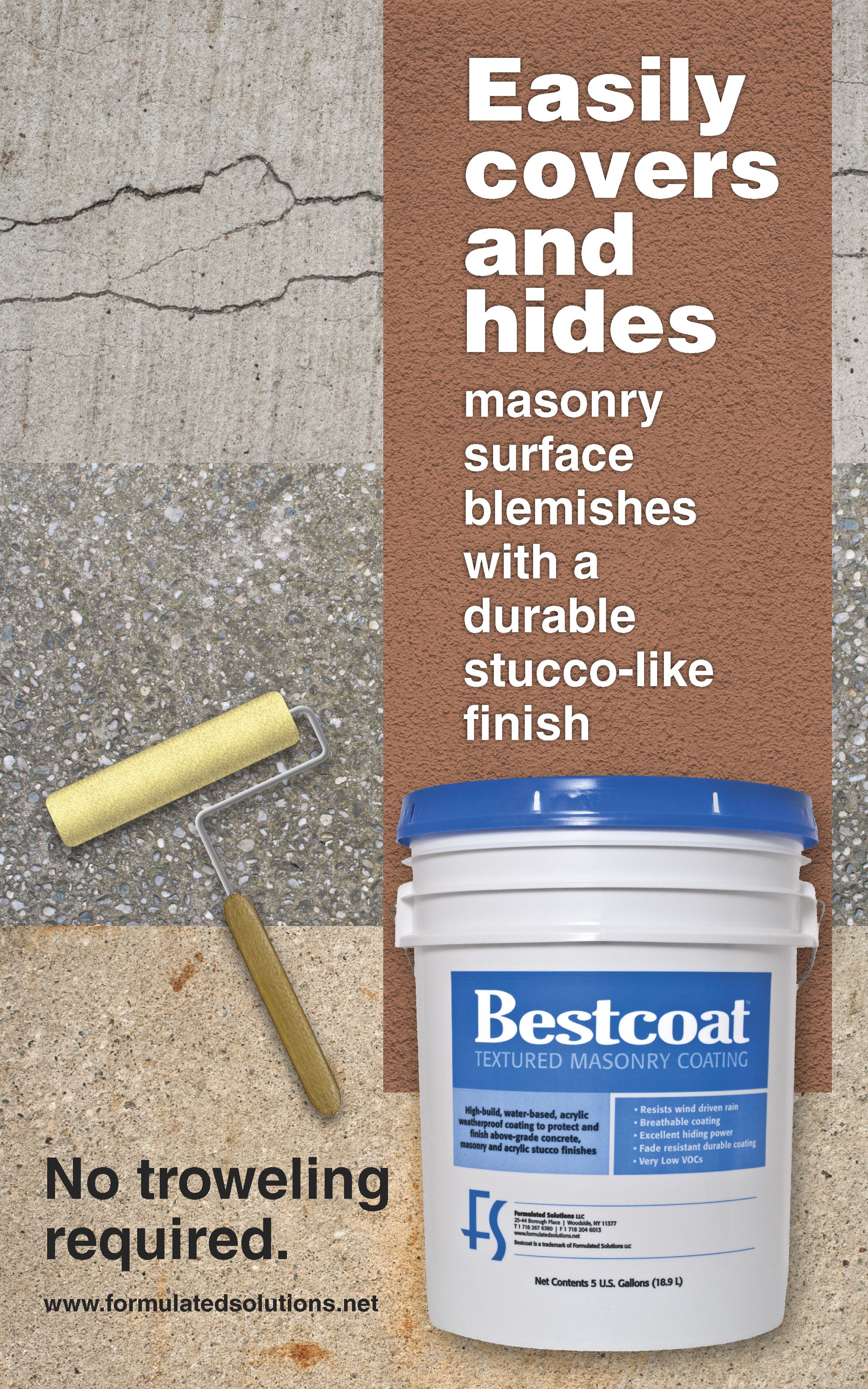
Words and images are most effective when designed to support each other as strongly as possible. This point-of-purchase banner graphically speaks to professional painters and masons while words drive the visual message home.

 
Image of a large point-of-purchase banner representing three different kinds of worn concrete surfaces in need of repair. A large swath of stucco-like coating completely obscures the cracks, coarse aggregate and rust stains. A paint roller and a 5-gallon pail of Bestcoat Textured Masonry Coating are featured in the foreground. The words “No troweling required” appear below the paint roller. The dominant words on the poster are “Easily covers and hides masonry surface blemishes with a 
                                        durable stucco-like finish”.


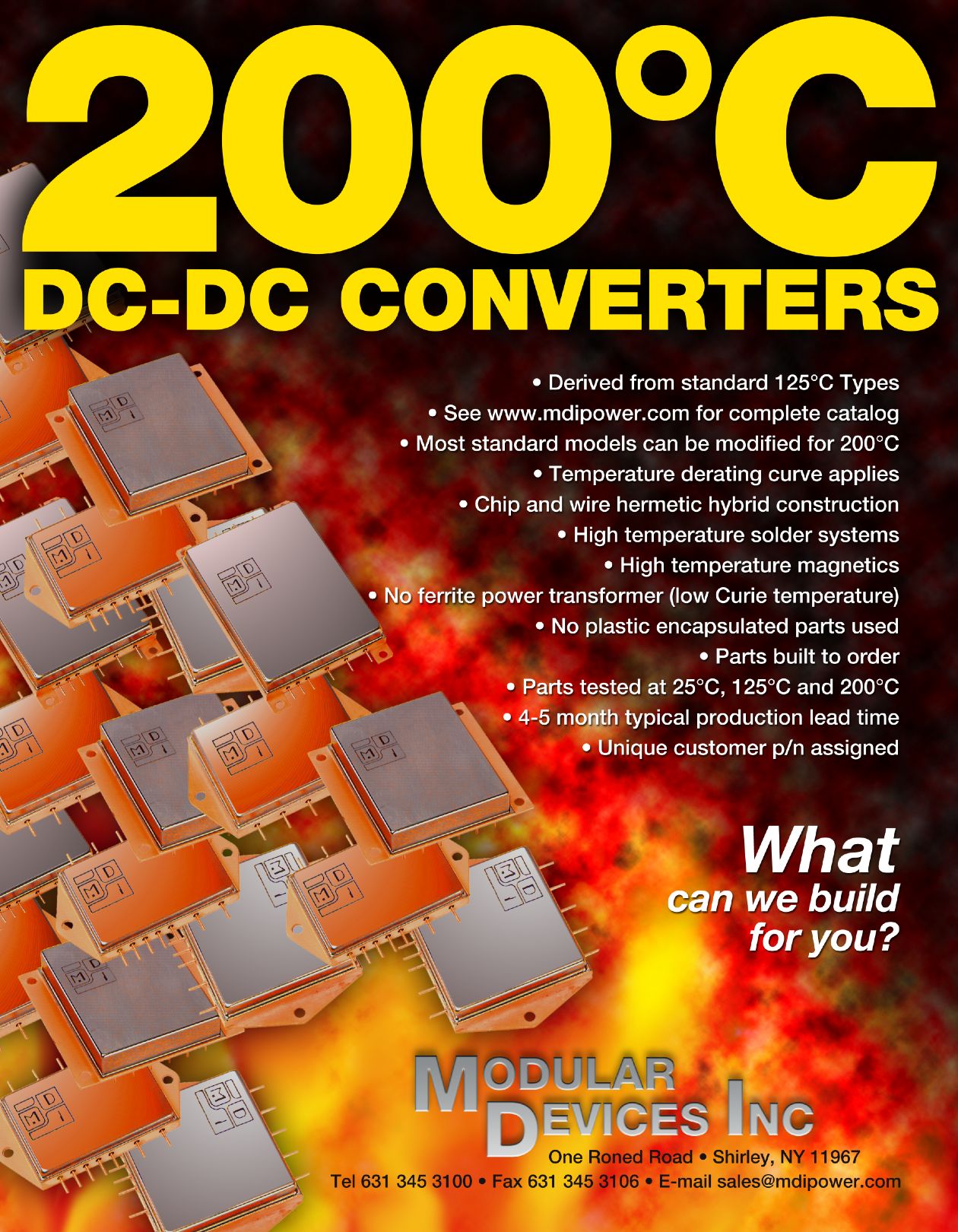
What makes a 200°C DC-DC converter special? In the flyer below, our client’s robust hybrid power devices are unfazed by otherworldy levels of heat.

 
This product sell sheet features a very prominent headline using the words “200-degree DC-DC converters” over a large collection of small electronic devices roiling atop an intense fire.


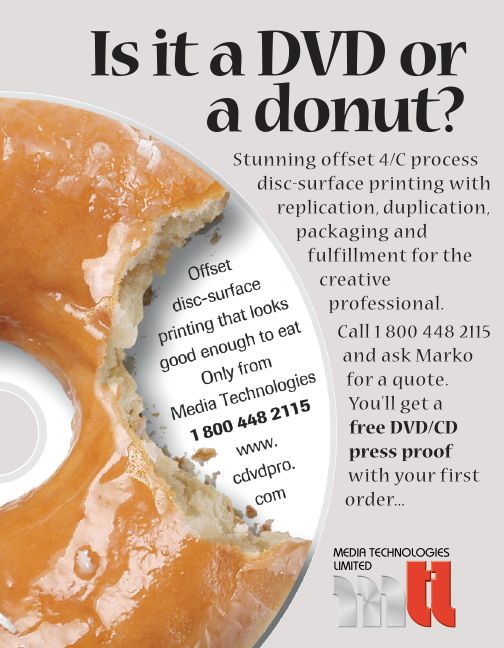
In the ad below, our client demonstrates a printing process so realistic that it makes a plastic disc look good enough to eat.

 
This is a quarter-page ad that features an enticing photograph of a glazed donut with a big bite taken out of it, with crumbs lying  on a digital disc. The headline asks “Is it a DVD or a donut?”


A defining quality of graphic communication is its ability to bypass language barriers, but there is more to it than that. Let’s take a closer look at how imagery communicates on the next page….

menu

Previous page button.
 
Next page button.